
Omnichain UX design limits to account for
Designing for omnichain environments requires accepting friction as a feature rather than a bug. Users do not care about the underlying protocol differences between Ethereum, Solana, or Cosmos; they care about whether their transaction succeeds and what it costs them in fees. The primary constraint is visibility: making invisible cross-chain bridges tangible without overwhelming the interface with technical jargon.
Unified State Visualization
The user must see a single state, not a fragmented ledger. When a transaction spans multiple chains, the UI should present a clear, linear progression rather than separate confirmations for each hop. LayerZero Scan’s explorer approach demonstrates this by treating the cross-chain journey as a single event with distinct checkpoints, allowing users to track progress without understanding the mechanics of each bridge.
Transparent Fee Abstraction
Gas fees on the destination chain are often a source of confusion. The constraint here is to abstract the complexity while maintaining transparency. Instead of asking users to hold native tokens for every possible destination chain, the UX should calculate the total cost upfront and handle the conversion internally. This reduces cognitive load but requires clear communication about exchange rates and slippage to maintain trust.
Consistent Error Handling
Cross-chain transactions fail more often than simple on-chain ones. The design must handle these failures gracefully. Rather than showing a generic "transaction failed" message, the interface should explain why—whether it was a bridge delay, a liquidity shortage, or a network congestion issue. Providing actionable next steps, such as retrying or contacting support, turns a frustrating dead end into a manageable hiccup.
Omnichain UX design choices that change the plan
Building a unified interface for multiple blockchains requires balancing three competing priorities: speed, clarity, and cost. There is no single perfect layout; each design choice favors one metric at the expense of another. Understanding these tradeoffs helps you select the right pattern for your specific use case.
| Factor | Approach | Benefit | Drawback |
|---|---|---|---|
| Transaction Visibility | Single-View Aggregator | Users see all assets in one dashboard without switching tabs. | High latency if one chain is slow to sync data. |
| Gas Payment | Meta-Transaction Abstraction | Users pay fees in any token; no native gas token needed. | Higher complexity and potential for unexpected fee spikes. |
| Cross-Chain Routing | Smart Default Routing | Automatically selects the cheapest/fastest bridge. | Users may not understand why their assets moved unexpectedly. |
| Error Handling | Chain-Specific Fallbacks | Clear messages when a specific bridge fails or stalls. | Fragmented UI that feels disconnected across chains. |
1. Aggregation vs. Specialization
An aggregated view, like the LayerZero Scan explorer, presents all chains in a single list. This reduces cognitive load for beginners but can overwhelm advanced users who need granular control. Specialized views, like the Tapioca DeFi platform, offer deep analytics for specific chains but require users to manually navigate between them. Choose aggregation for mass-market adoption and specialization for power users.
2. Fee Abstraction vs. Transparency
Meta-transactions hide gas fees from the user, making the experience feel like a standard web app. This increases conversion rates for new users. However, it introduces opacity. If the relay fee is not clearly displayed, users may feel surprised by the total cost. Transparent fee displays build trust but require more mental effort from the user to understand the breakdown.
3. Routing Logic
Smart routing automatically picks the best bridge. This is convenient but risky if the user cares about security over speed. A "slow lane" option allows users to choose slower, more secure bridges. This adds complexity to the UI but provides necessary control for large transactions. The tradeoff is simplicity versus safety.
Design Inspiration for Omnichain Interfaces
-
LayerZero Scan Explorer
A clean, data-dense dashboard that aggregates multiple chains into a single searchable interface. Ideal for reference on data hierarchy. -
Omnichain Finance Platform
Maya Henry’s motion design showcases how to animate cross-chain transfers, making the invisible process of bridging feel tangible and fast. -
Tapioca DeFi Bank
A minimalist, retro-futuristic aesthetic that simplifies complex DeFi interactions through visual clarity and reduced clutter.
4. Error Recovery Patterns
When a cross-chain transaction fails, the user experience can make or break retention. A chain-specific fallback system provides clear, actionable steps for each type of failure. This is more complex to build but reduces support tickets. A generic error message is easier to implement but leaves users confused and stranded. Always prioritize specific error recovery paths.
5. Onboarding Complexity
Omnichain wallets often require users to understand concepts like bridging, gas tokens, and network selection. Simplifying this through "smart defaults" reduces friction but may hide important details. A hybrid approach offers a simplified default mode with an "advanced" toggle for power users. This balances accessibility with control.
The Omnichain UX Blueprint: Unifying Web3 Wallets, AI Agents, and Legacy Systems
To build a functional omnichain interface, you must treat cross-chain interactions as a single, continuous user journey rather than a series of disjointed transactions. This requires a unified design language that abstracts away the underlying complexity of different blockchains while maintaining transparency about asset states.
The following steps outline how to structure this blueprint, ensuring that Web3 wallets, AI agents, and legacy systems communicate effectively without confusing the end user.
Start by visualizing all assets across chains in a single dashboard. Users should see their total net worth and specific token balances regardless of which network holds the funds. This "single pane of glass" approach reduces cognitive load and eliminates the need to switch between multiple wallet interfaces to check status.
Define clear, consistent patterns for bridging assets. Whether using a native bridge or an aggregator, the UI should present the same confirmation steps, fee breakdowns, and estimated arrival times. Consistency here builds trust, as users can predict the outcome of their actions regardless of the source or destination chain.
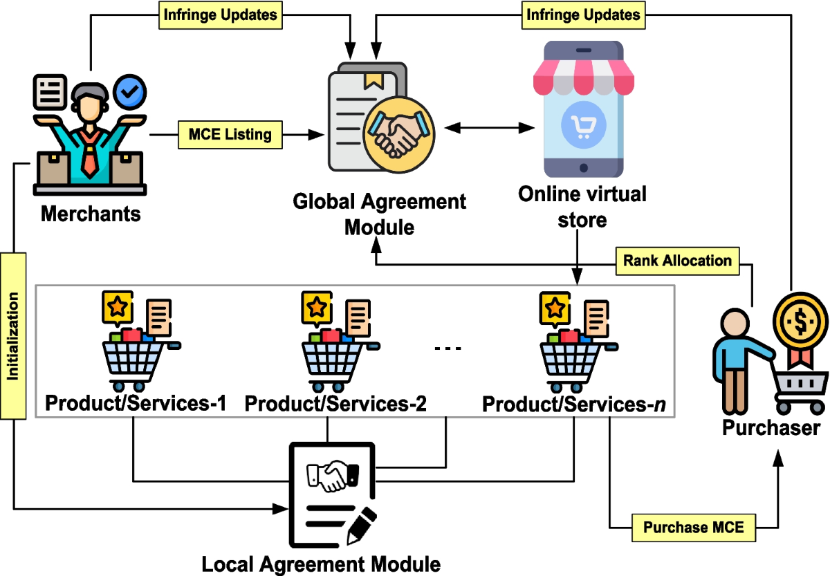
Embed AI agents that monitor network congestion and gas prices to suggest optimal execution times. Instead of forcing users to manually check Etherscan or Solscan, the interface should proactively advise when a transaction is likely to succeed or when a delay is expected, turning raw data into actionable insight.
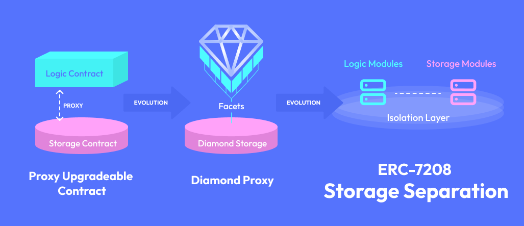
Ensure the frontend can communicate with traditional banking APIs and legacy databases through standardized middleware. This allows fiat on-ramps and off-ramps to feel as seamless as crypto swaps, providing a familiar experience for users transitioning from traditional finance to omnichain environments.
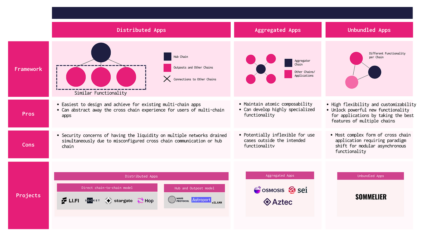
Design permission models that allow users to set specific limits for cross-chain interactions. AI agents should operate within these bounds, executing routine tasks like rebalancing while requiring explicit user approval for high-value or complex bridge transactions, balancing automation with control.
Spotting Weak Omnichain UX Claims
The term "omnichain" has become a catch-all for any cross-chain feature, making it difficult to distinguish genuine infrastructure from marketing fluff. For the 2026 blueprint, you need to look past the buzzwords and evaluate the actual user experience. Many platforms promise seamless interoperability but deliver fragmented flows that break trust when transactions fail or fees spike unexpectedly.
1. Hidden Friction in Cross-Chain Swaps
Many wallets advertise "one-click" swaps across chains, but the underlying process often involves multiple confirmations and unpredictable latency. Users frequently encounter unexpected gas fees on the destination chain or fail to receive their assets within the promised timeframe. A robust omnichain UX must clearly display total costs, including bridge fees and destination gas, before the user commits to the transaction.
2. Inconsistent Asset Visibility
A common mistake is showing an asset as available in one view but failing to reflect its locked status on another chain. This disconnect creates confusion and erodes trust. Effective designs synchronize asset states in real-time, ensuring that what the user sees in their wallet matches the actual on-chain reality. If an asset is bridged, the UI should reflect its transit status rather than duplicating the balance.
3. Poor Error Recovery Flows
When cross-chain transactions fail, many interfaces provide generic error messages like "transaction failed" without offering actionable next steps. This leaves users stranded, unsure if their funds are lost or stuck in a pending state. Good UX includes clear recovery paths, such as canceling stuck transactions or contacting support, reducing anxiety and support ticket volume.
Omnichain UX design: what to check next
Navigating the convergence of Web3 wallets, AI agents, and legacy systems requires clarity on where friction points actually live. These answers address the practical objections developers and product managers face when building for this hybrid environment.
No comments yet. Be the first to share your thoughts!